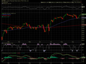
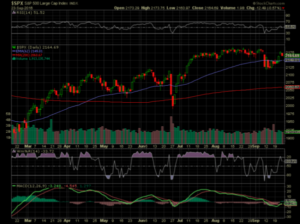
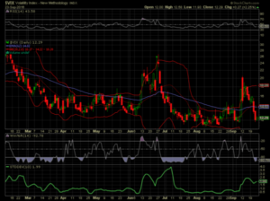
This is what I look at over the weekend,courtesy of Stockcharts.com, looking for opportunities in the next week. My choice of indicators is nothing special. In fact the free facilities on Stockcharts.com are excellent. I make no claims about the predictive powers of my choice of settings.
Caveat: Do your own research
Stockcharts has a fantastic educational resource, which explains how the various indicators work. Some of them claim to be predictive, though these should probably be taken with a dose of skepticism. One would be hard pressed to find a trading room that had no charts on their screens. Maybe like advertising you have to do it because everyone else is.
Among the most common indicators, as in the chart below are RSI – relative strength. Williams%R which is in fact an inverse stochastic, and MACD-moving average convergence and divergence. These are based on smart maths formulae, above my pay grade!
Perhaps lesser known but in our options world, a powerful indicator, as seen in the VIX chart below……Bollinger* bands. This is based on volatility, and in a nutshell if price goes outside the bands you take the opposite trade. Note the VIX around Brexit.
VIX is itself a measure of volatility so it is not about price action but movement.
Typically it moves opposite to the value of the underlying asset on which it is based- the SPX. (The Standard and Poors 500,which has 500 US stocks.) Actually the VIX is based on near the money option prices. Volatility means everything to options traders, as it affects prices. *Invented by John Bollinger http://www.bollingeronbollingerbands.com
Charting is a skill/art/science all of its own
There are ‘technical analysts’ that I have met who never trade, but love the process. Another great resource is http://www.updata.co.uk run by David Linton who appears regularly at the UK money shows throughout the year. They will send a weekly email with their own take on the markets-for free. Updata also like such exotic indicators as Ichimoku Kinko Hyo, which comes from Japan. So do the candlesticks which many of us use in buy CBD products own charts, as below- green ones mean that price went up that day(on a daily chart) and naturally, red ones down. Candlesticks are pretty much self explanatory and as a visual aid I think they are fantastic. I sometimes use this for a simple up/down day count too ( historically 51% of trading days are up days, allegedly). Market statistics can be overwhelming and too much information is as bad as too little. You have to be selective. Chart settings too-even in the free section are all adjustable, as on Yahoo and Google. Charting is nearly always a part of a trader’s armoury. It can be addictive and fun, with education available at some cost from https://www.sta-uk.org/education/
FTSE,SPX and VIX
 V
V