Here’s something from the vaults
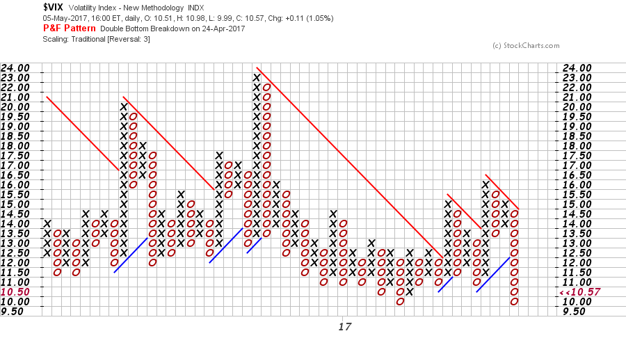
What IS this? It’s an old fashioned way of charting price action. http://www.investopedia.com/terms/p/pointandfigurechart.asp
In the explanation, the columns change, due to price action. As above in this Stockcharts.com example, which is based on a 3 box reversal. Note that each box is,therefore, worth 0.5. X for up O for down.The chart shows VIX has again hit this ‘crazy’ low support at 10. I thus consider this noteworthy. I like the idea that VIX is a quantity, and not therefore time sensitive. My reliable source tells me short interest in VIX recently hit epic proportions. Therefore, as a contrarian, I take that as the dumb money doing something dumb. Vix has previously hit 100 in a heartbeat-why would you bet against that happening? Please tell me!
Low VIX=highmarket=unrealistic expectations. At least in my jaded opinion.

Hi. Very good article,thanks for sharing. I visit this website every day.